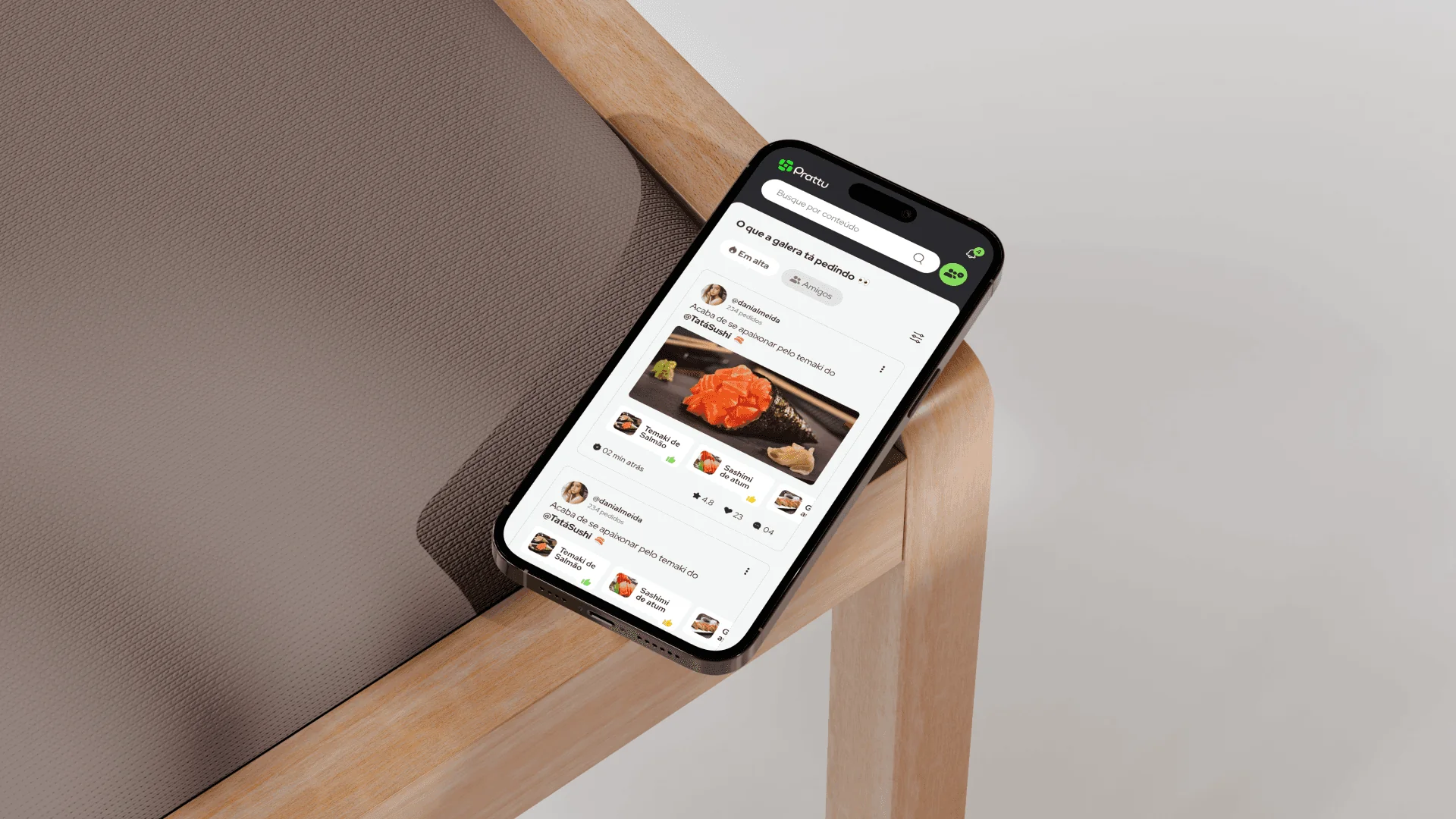
Prattu
2024Prattu is a delivery app without the delivery: you order, pick up and eat, with no fees. And there's a social layer. You see where your friends are actually eating and get recommendations from people you know, not from an algorithm.
The challenge
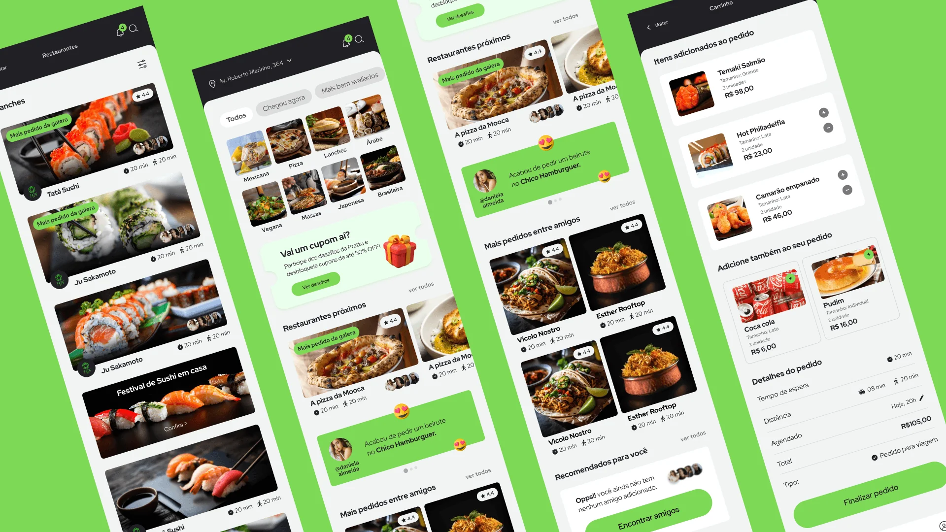
A lot of screens that had to feel like one thing. Ordering and social discovery usually live apart, and here they share the same interface: fast for someone who just wants to eat, engaging for someone who wants to browse. At that volume the risk isn't one bad screen. It's dozens of screens that don't look like they came from the same place.


The solution
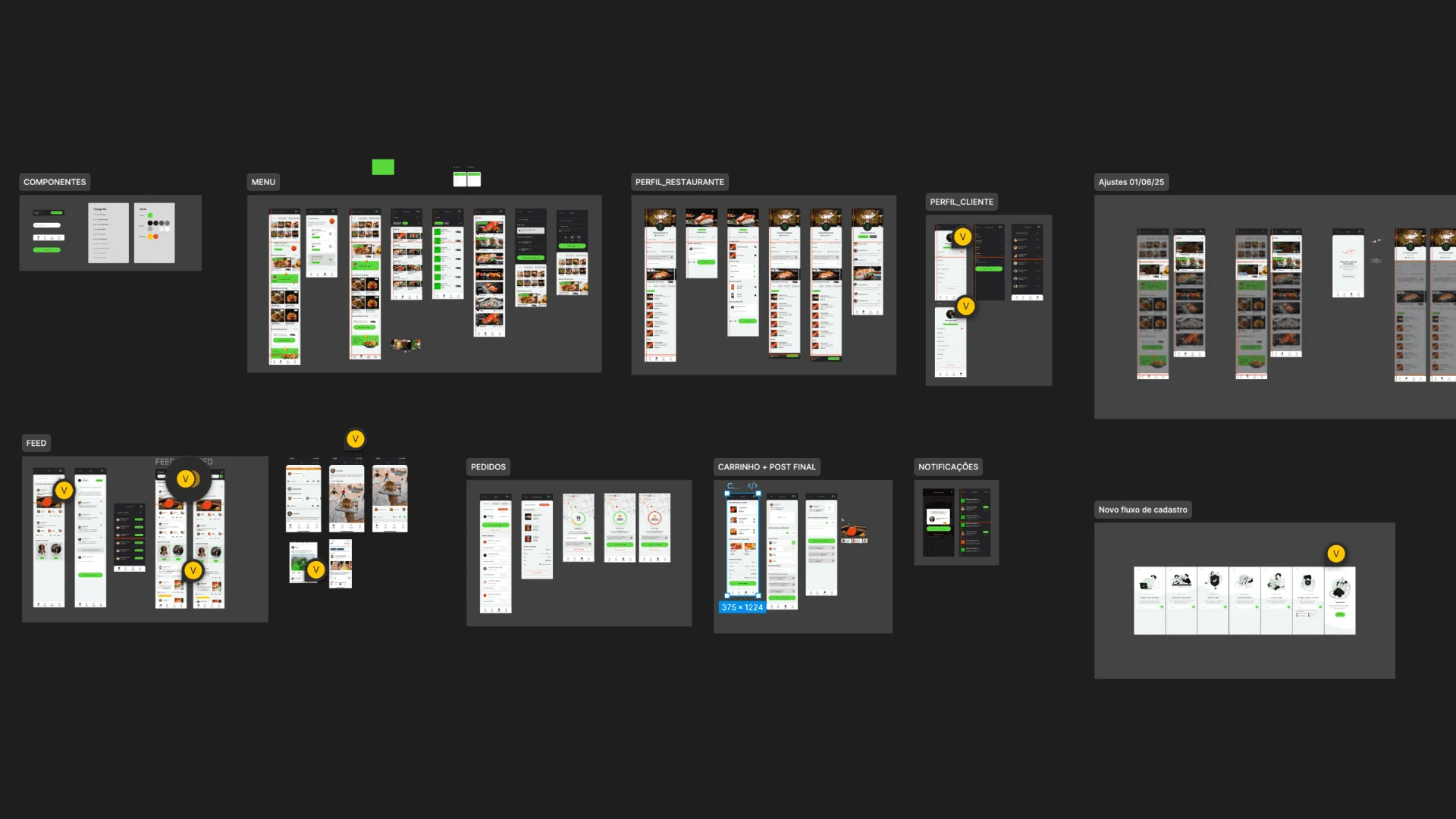
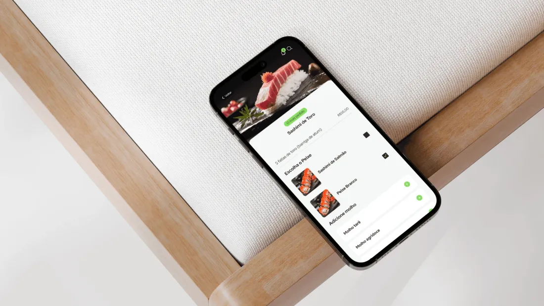
They came in with the strategy settled, positioning, features and model, so I started by auditing what already existed: the scope, the flows, what was holding up and what wasn't. Some journeys I changed. Some screens didn't exist yet and I added them. Then the full set of screens in Figma, with hierarchy, states and components consistent across the product, so the social layer never gets in the way of ordering and ordering never kills the browsing. The idea arrived solved. Making it hold up as a product didn't.
The outcome
Live on the App Store.