Charlotte de Witte
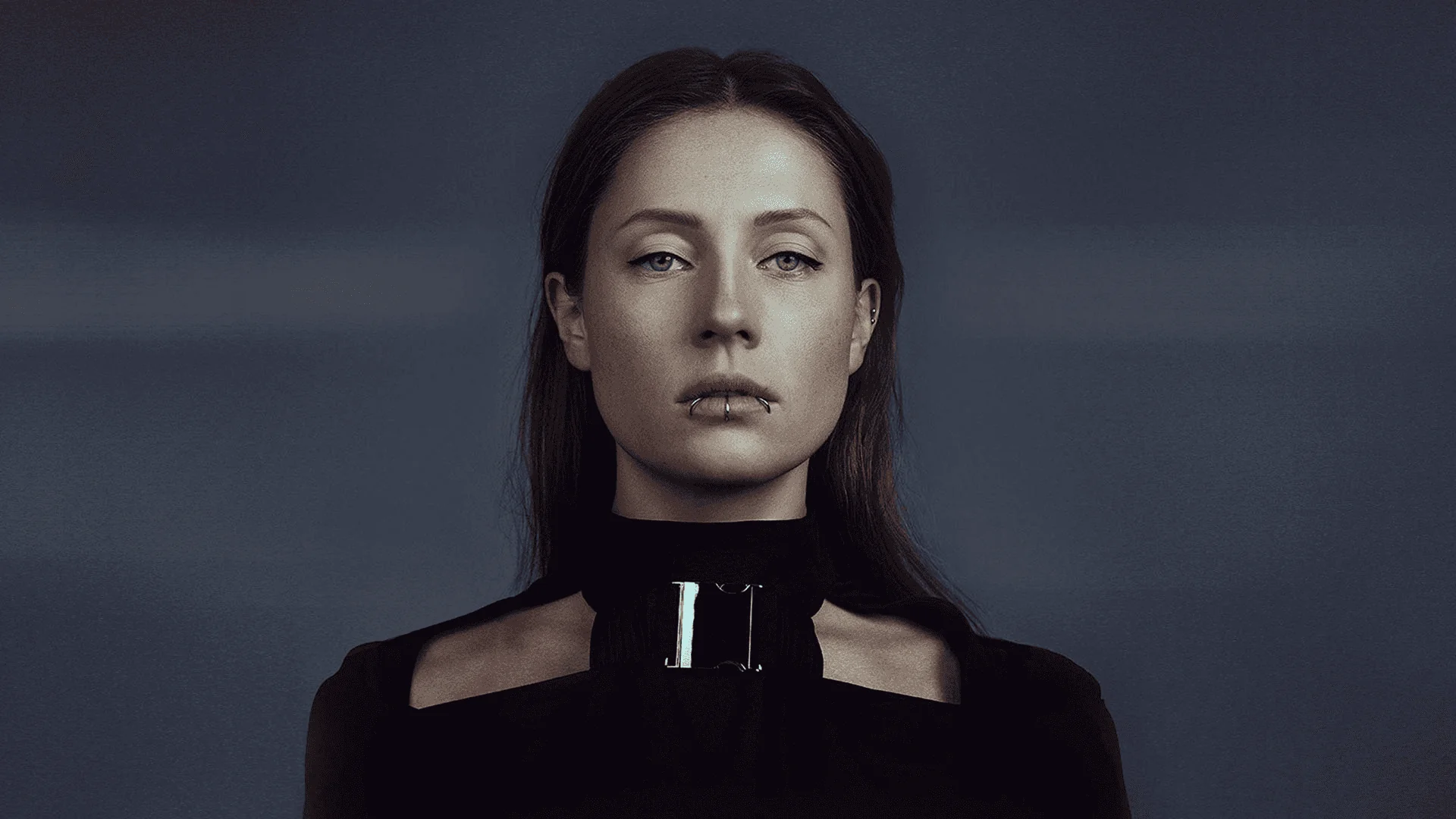
2024Charlotte de Witte is one of the biggest names in techno: #9 in DJ Mag’s Top 100, a festival headliner, and the founder of her own label, KNTXT. Raw, hypnotic sets and an audience that follows the sound, not the singles.
The challenge
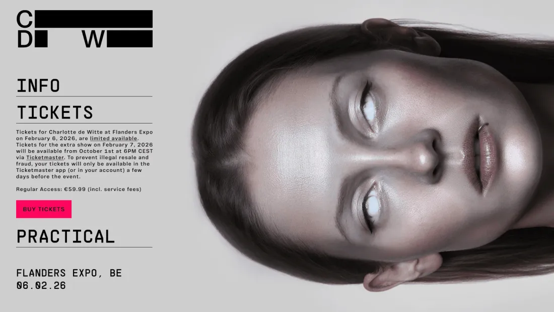
Her site looked like a press kit. Static layout, safe hierarchy, the same template every touring artist uses, the exact opposite of what she does on stage. And a screen has no volume: you can't borrow the intensity of the music. It has to be built with typography, contrast and rhythm, or it simply isn't there.
The solution
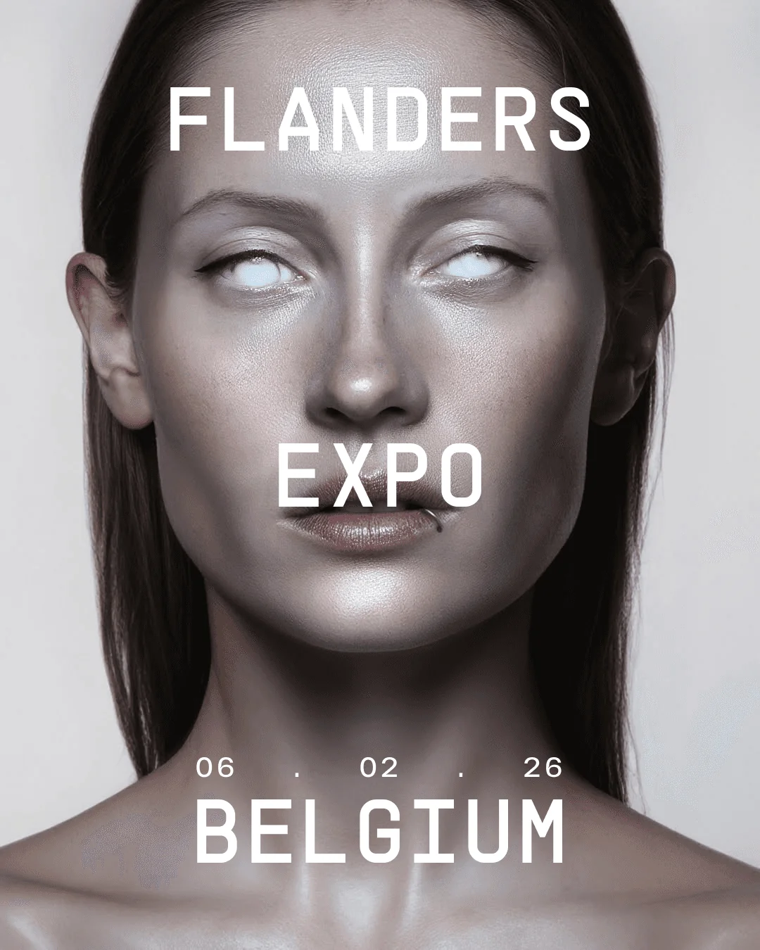
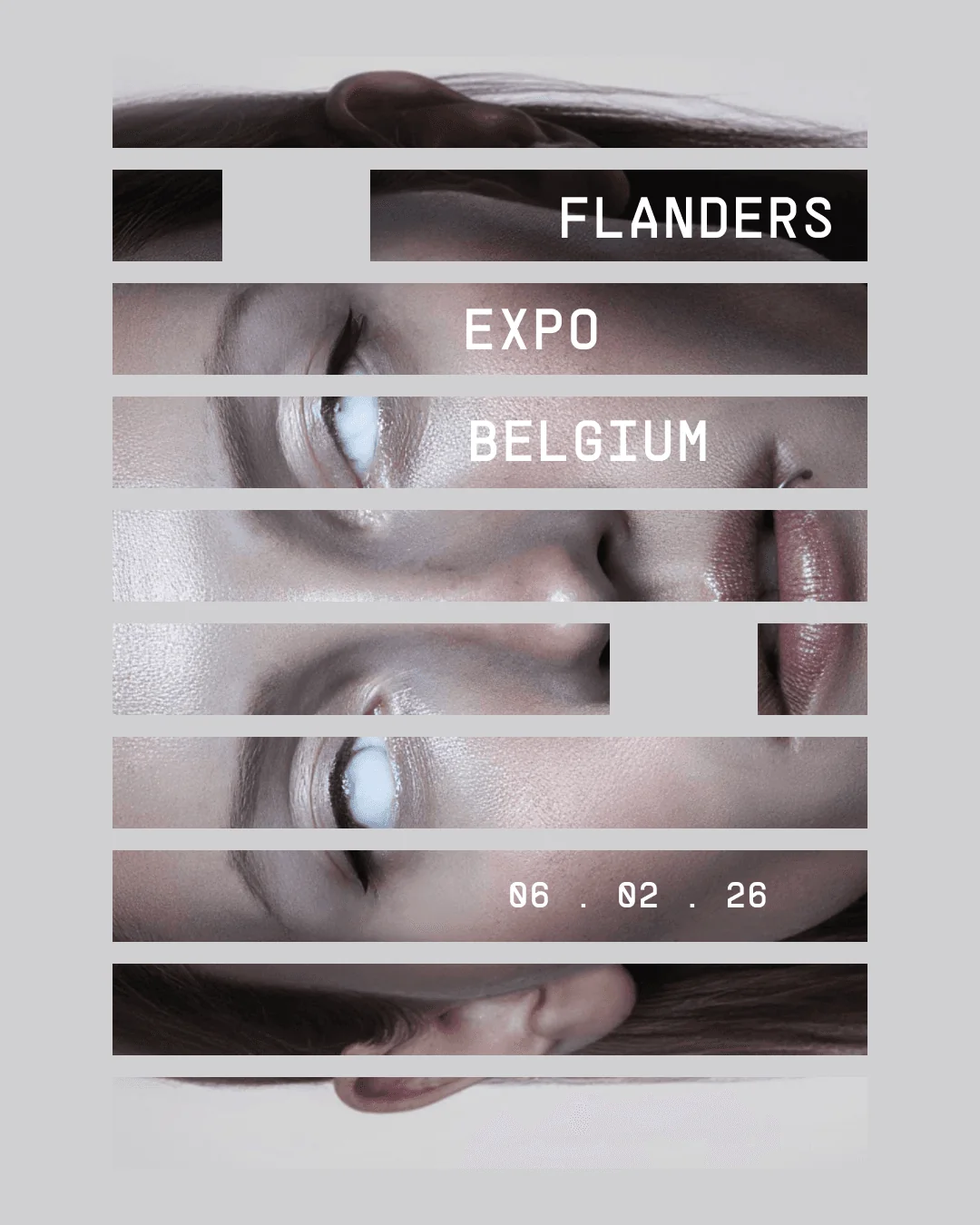
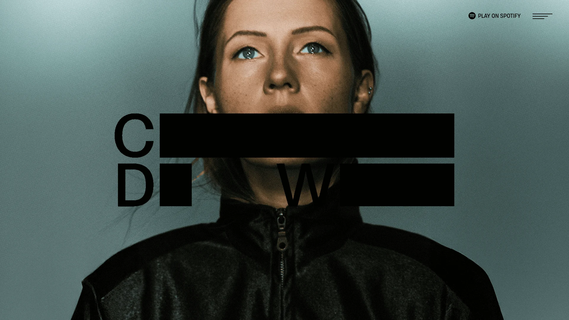
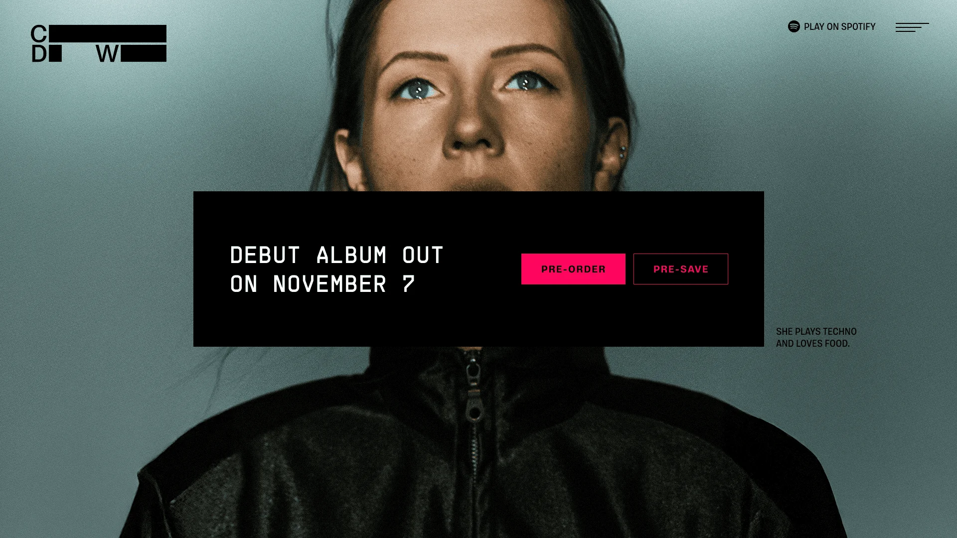
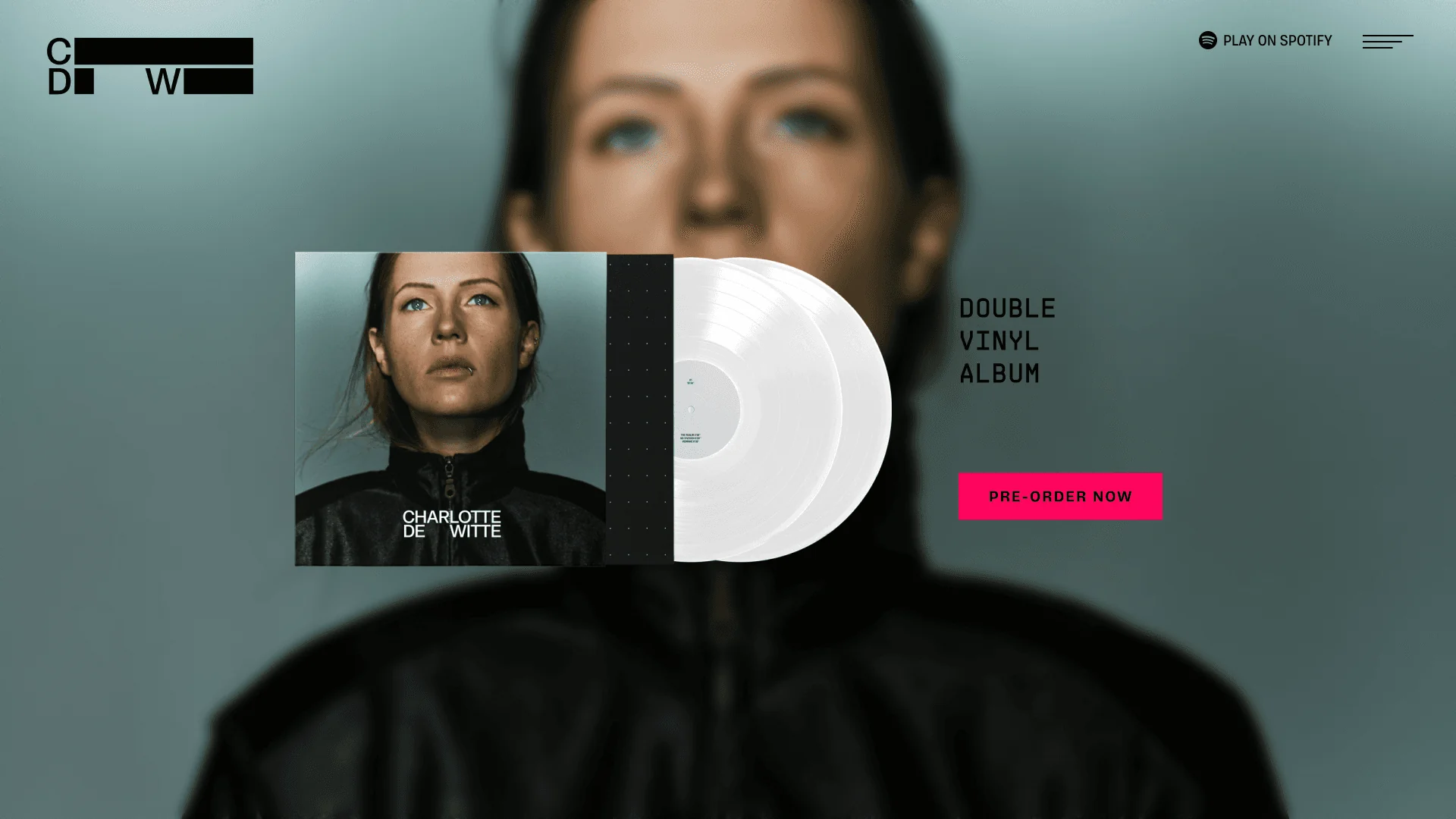
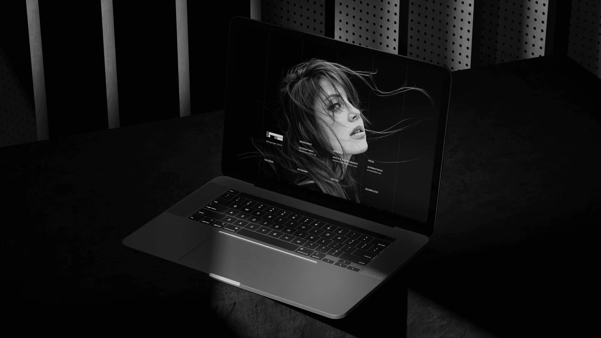
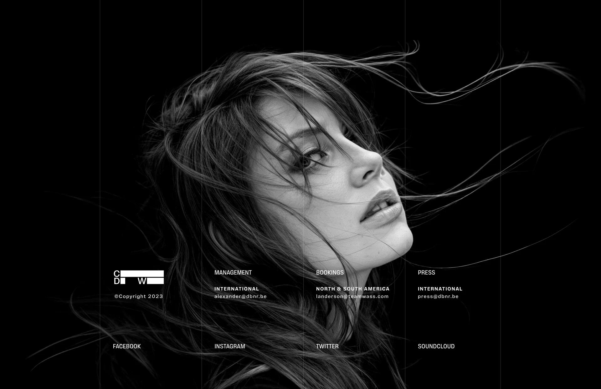
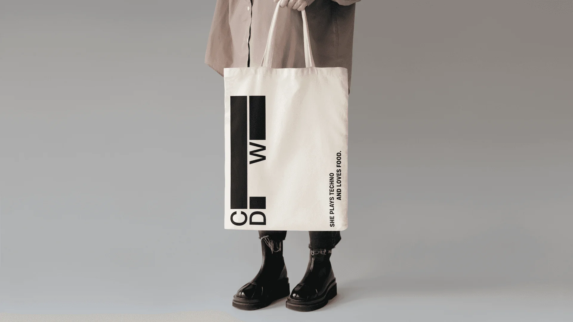
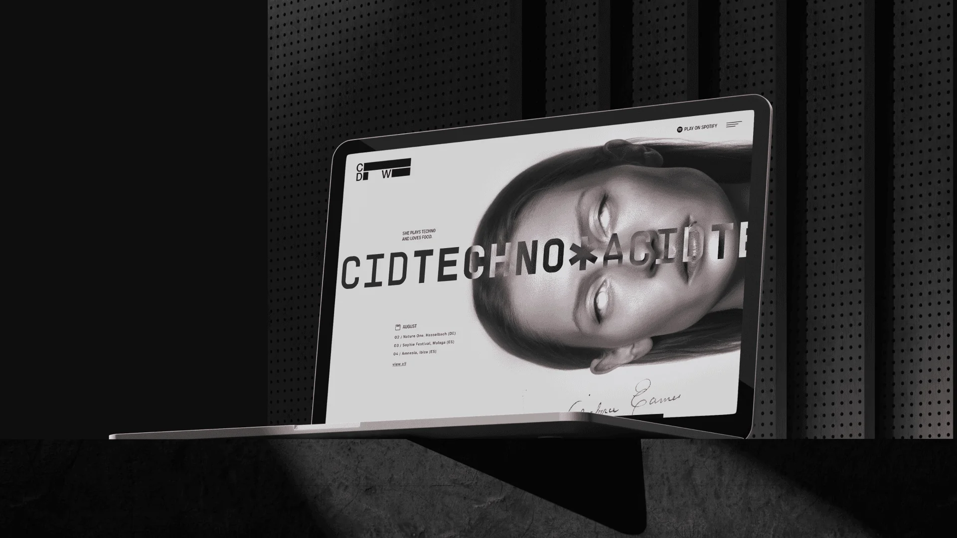
I treated the site as an extension of the set, not a page about it. Brutalist typography takes over the screen and sets the tone above the fold, while a dark, high-contrast palette comes straight from the floors she plays. The experience comes alive through movement. I built it in Framer with scroll-driven animation, microinteractions that build tension, and transitions that never break the flow. The navigation is almost invisible on purpose: the goal is immersion, not structure. The same visual language carried into the key art and campaign posts. The project came through a US agency that regularly sent work my way.